Competing directly with Square, Clover launched it’s first direct sales channel with clover.com/shop.
Designed a solution finder to guide small business owners — many unfamiliar with POS hardware — toward the right Clover devices and accessories for their needs. The tool asked simple, goal-oriented questions to surface tailored product recommendations, reducing overwhelm and increasing buyer confidence. This was part of launching Clover’s first direct sales channel, where I also supported the overall /shop design and contributed to building the style guide. This work contributed to a measurable lift in Clover’s top KPI: merchant accounts opened.
Shifting to a merchant-driven experience
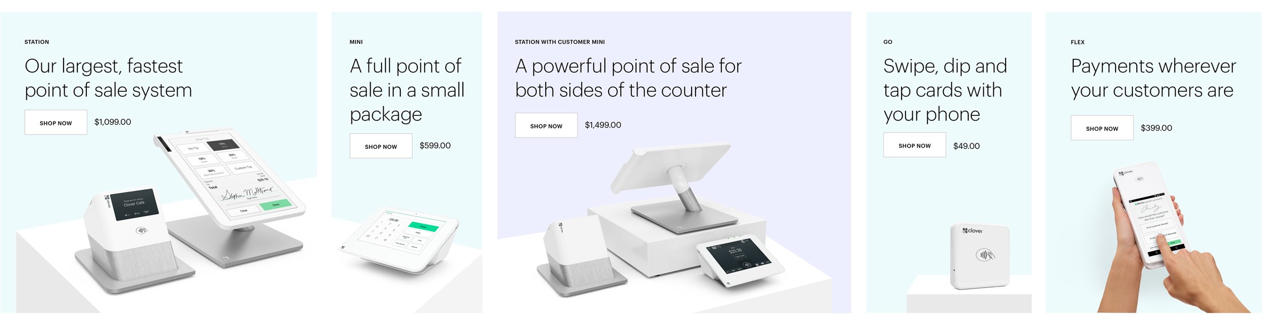
For this launch, I made it easy for merchants to compare and shop for Clover devices. Merchants have the option to add hardware accessories and software integrations to customize their Clover system. I worked with the lead designer and stakeholders to map out the needs of different businesses and identify the most successful devices and add-ons for each vertical.

This data informed the questions that I needed to ask in order to correctly sort merchants by vertical and specific feature/payment needs. To keep users engaged, I streamlined the user flow and also created "off-ramps" to direct merchants to specialized apps in the Clover App Market. Merchants can also connect with the sales team if they require further assistance.
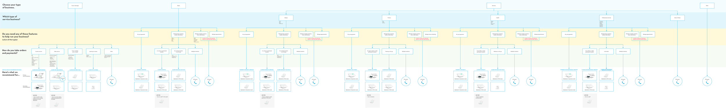

Designing a solution finder
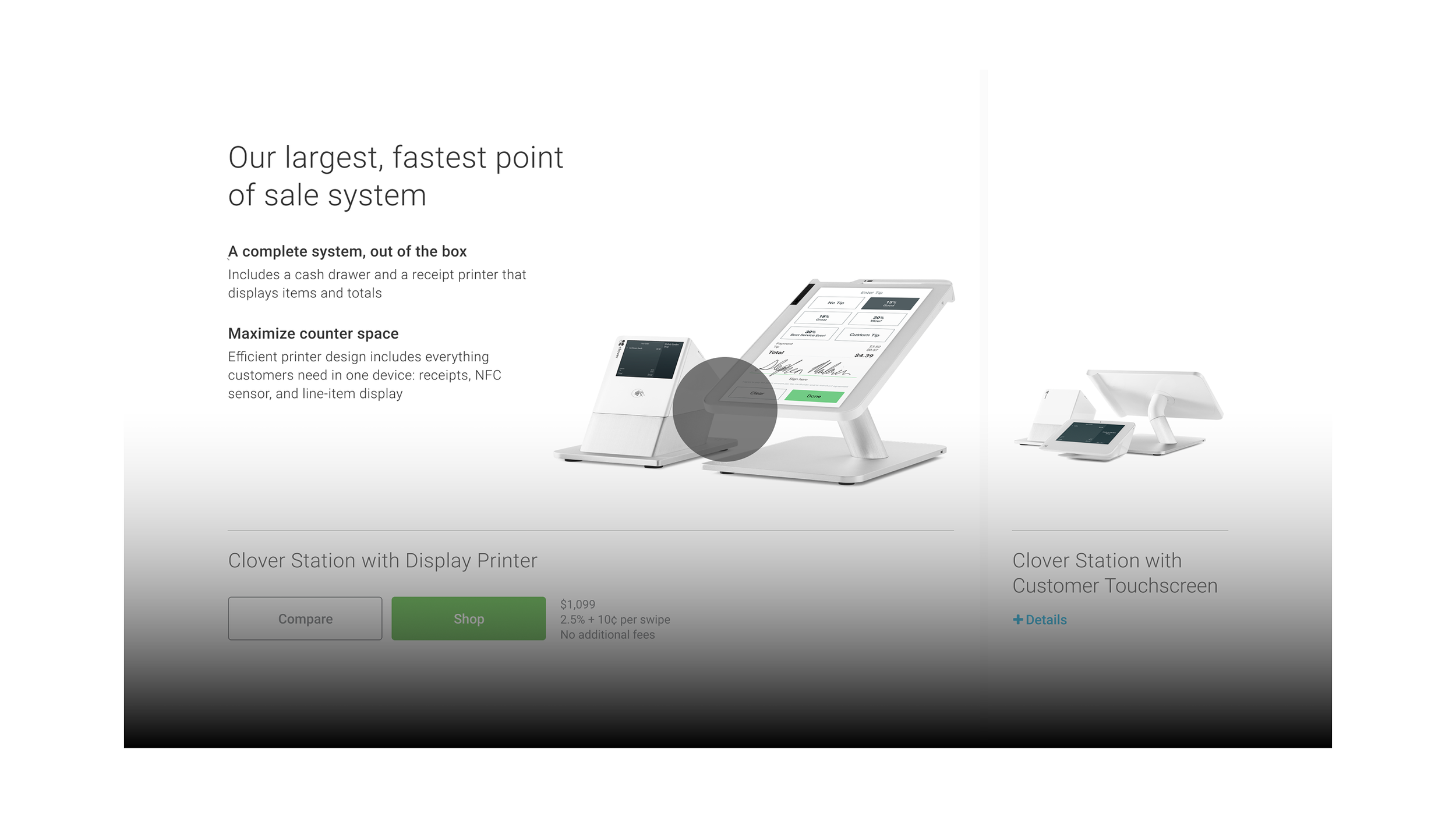
On the /shop homepage, merchants are prompted to enter a full-screen lightbox and answer three to four simple questions about their business. Based on their answers, a primary and a secondary Clover device are recommended. To display detailed product views and a side-by-side comparison, I created a slider module. Any add-ons are highlighted below the slider module.
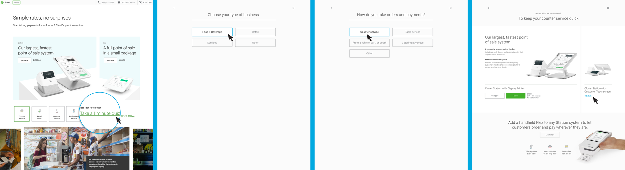

Slider module
This module was designed to address space constraints, making it easy for users to switch between individual product details and side-by-side comparisons without excessive scrolling. It can also be found on Clover Station landing pages, where it compares up to three devices.
Designing the details
A minimalist design, mobile-friendly considerations, and attention to detail with micro-interactions helped me achieve our project vision of conveying quality through design and performance.
⚡ INTERACTIVE PROTOTYPE
I used After Effects and Figma to create a prototype that illustrates and tests the interactions between recommended devices. The prototype is intended for desktop use, but the slider module is designed to be responsive and work across all screen sizes, with some limitations in the comparison view on mobile.
Please note that button hover states are only displayed on the first screen due to technical limitations.
ROLE ON
DIGITAL DIRECT SALES TEAM
Senior Product Designer
My role involved collaborating with cross-functional teams, focusing on UX development and journey mapping to understand user needs. I led wireframing efforts and UI design, creating prototypes for testing with users. I actively engaged in sharing updates and soliciting feedback from leadership regarding our design direction.
As a member of the design team, I participated in the design and maintenance of our pattern library, ensuring consistency across products. My responsibilities extended to visual design and art direction of device images, establishing design processes, and coordinating with various teams including business operations, marketing, and feature teams. I also served as a mentor to junior team members and played an active role in the design team's culture initiatives.
IMPACT
The launch of a new direct sales channel transformed our approach from sales-driven to merchant-driven, significantly widening the top of our lead generation funnel. By implementing strategic nurturing pathways, we successfully encouraged merchants to upgrade their software and add hardware over time. These initiatives directly drove our primary KPI, resulting in a measurable increase in merchant accounts opened.
NEXT PROJECT