Clover’s order ahead feature started as a hackathon win that made it onto the product roadmap.
I co-led design for the order ahead pilot launch and focused on integrating loyalty features, like awarding and redeeming perks. Balancing these incentives with a fast, intuitive pickup experience was a key UX challenge. This drove a measurable increase in payments made through the app and created a competitive edge that boosted app downloads and merchant adoption of Clover.
HOW IT STARTED
Clover hackathon winner
In March 2018, Clover held an internal two-day hackathon challenging employees to bring innovative ideas for solving problems faced by merchants, customers, internal teams, or third-party developers.
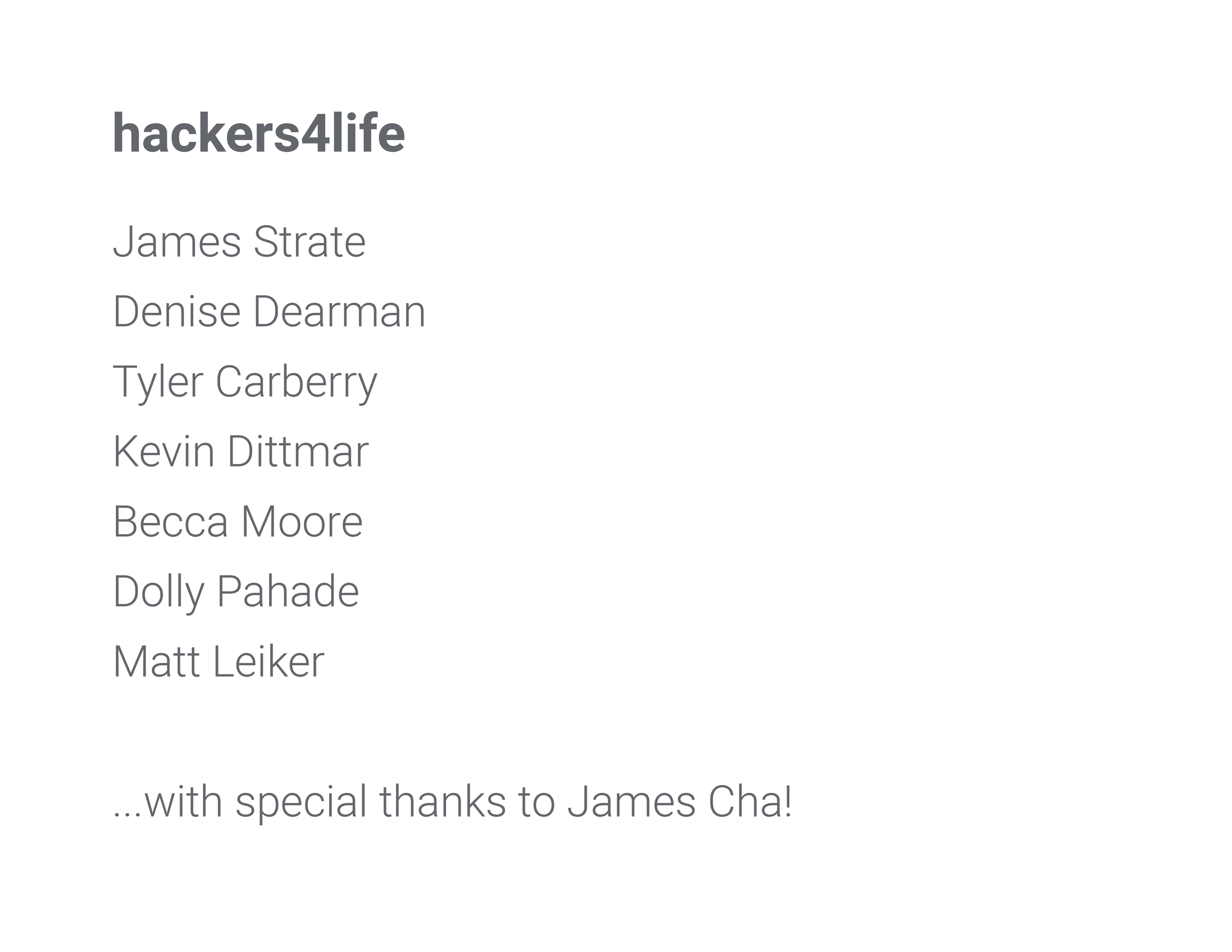
My team, hackers4life, presented our project called ‘Auto Order’ and won. We were awarded a fancy lunch in Soho and the opportunity to extend our quick pitch into a product feature epic on the company’s roadmap. Six months later, mobile ordering capabilities were live in the Clover app.
Auto Order hackathon pitch + demo:

PILOT LAUNCH
Adding mobile ordering to the Clover app
To launch this new feature quickly, we simplified the process and minimized barriers. To meet our team's tight deadline for the pilot, I relied heavily on existing UI patterns and functionality with the goal of adding more refinements in future releases.
The merchant view gets a new tab
The Clover app's merchant view displays all the perks offered at a business location and the user's progress towards earning those rewards. While displaying an entire menu was out of scope for the pilot launch, steps were taken towards this goal by including a user's past orders that have been validated through the app. To accommodate a potentially long list of menu items, the space under the business information is divided into two tabs. The default tab displays the merchant's "Perks", and the second tab contains the user's past purchases.

For the pilot launch, "Re-order" is used instead of "Order ahead" to prevent confusion, as users can only order items they've previously bought in person. A message explaining this feature is shown for first-time users, and menu items are displayed using the existing card UI pattern and functionality.

Ordering and payment
Relying on existing functionality from the payment feature, I designed an order drawer at the bottom of the screen that updates when "Order it again" on the menu item cards is tapped.
Order preview:
Up arrow indicator (to show users they can tap or slide it up)
Number of items
Total amount
Text for tax inclusion
Text for tip inclusion (autotip: recurring tip added automatically)
Place order button (skips the order expanded view for quick ordering)
Expanded view:
Merchant name and pickup location
Item details, including modifiers that the customer previously requested
Item quantity (editable)
Subtotal, taxes, tip, and payment method (editable)

Adding in redeemable perks
In addition to the existing redeemable card state in the “Perks” tab, earned rewards are highlighted in the order preview and displayed in the expanded order view.

Order success
The order ahead success state is a confirmation receipt that displays directions on what the user should do next, points earned from purchase and the payment total. An order pickup notification is also displayed on the main screen, of the app.
ROLE ON
HACKATHON TEAM
ROLE ON
PIOLT LAUNCH TEAM
Lead UX Designer
My hackathon teammates included a Product Manager, two Senior Software Engineers, an Android Developer, and an iOS Developer.
Senior Product Designer
I led UX, UI, prototyping, and user testing for integrated loyalty features while collaboratively developing the ordering flow with another Product Designer. Our cross-functional team included a Product Manager, SQA Analyst, and Engineering Team, with guidance from our Design Director.
IMPACT
The order ahead feature created a significant competitive advantage that increased app downloads and expanded the Clover user base. Most importantly, it drove a measurable increase in payments made through the app, directly impacting revenue and demonstrating the value of our enhanced user experience.
NEXT PROJECT


