Clover Rewards enables merchants to create a loyalty program that lets customers collect points and earn perks, which are displayed as cards in the Clover mobile app. The unified card view project standardizes these cards across the entire Clover ecosystem.
ROLE
As a Senior Product Designer, I defined the card structure and created a design system to standardize all of the perks available on the Clover platform.
RESPONSIBILITIES
UX, interaction, visual design, UI, prototyping, testing
Development of a design system and pattern library for the team to reference and build upon
Cross functional collaboration with web, mobile app and Clover POS teams
RESULTS
Simplified system-wide updates and the introduction of new card types
Increased usage on the web dashboard and Clover POS for merchants creating and editing a perk
Consistent user experience for both merchants and customers on all platforms (web, Clover POS and iOS + Android mobile apps)
Decreased design to dev handoff time with detailed specifications and design guidelines
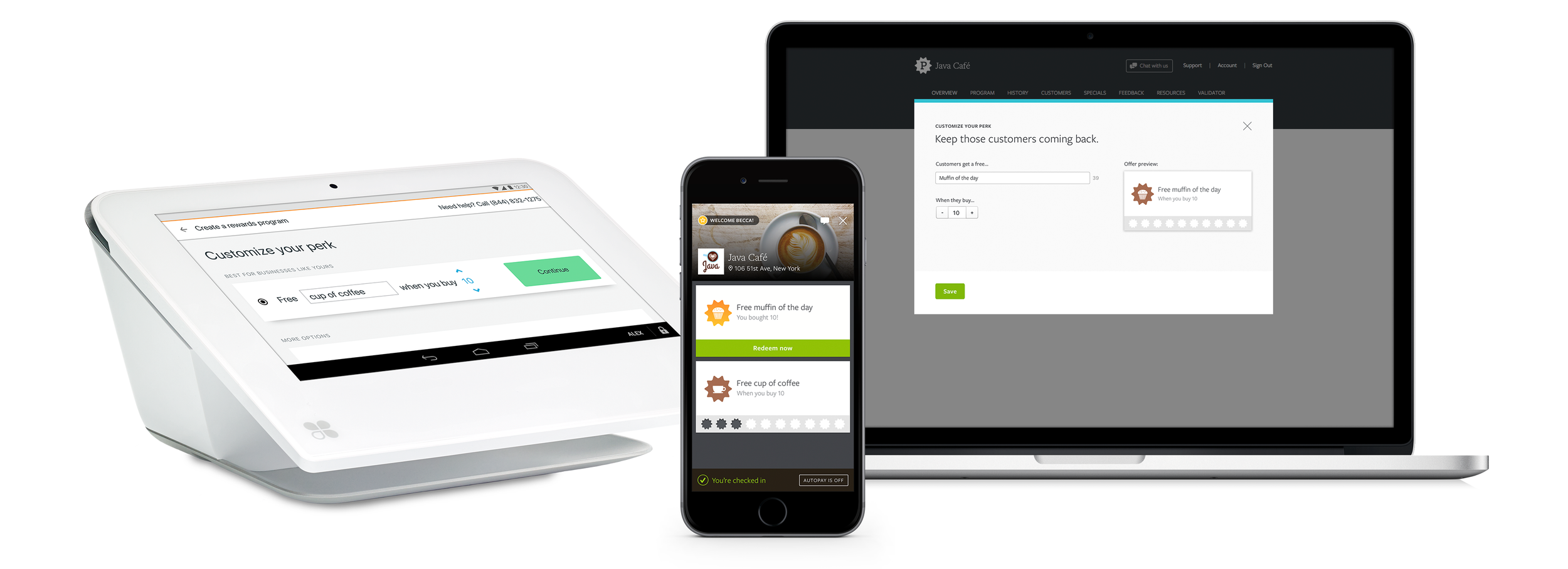
THE PROBLEM
The card model had become too complex, making it harder to maintain and limiting the ability to implement desired card types and behavior.
DISCOVERY
As the cards are the primary focus of the merchant's loyalty program and the reason why customers use the Clover app, I pushed for a complete redesign that included a new icon style.
Early exploration of a new icon style:
While wanting a fresh look and feel, early explorations revealed that the biggest challenge was ensuring system status visibility. It became clear that the current icons needed to remain for this project while I improved the usability of the cards. With so much information packed into a small space, I aimed for the cards to feel lightweight, delightful, and easy to use.
CARD LOGIC
To identify complexity around system status, it was important to define the logic of a card by addressing questions related to progress tracking, availability, redemption, restrictions, and dismissal.
CARD DESIGN

Designing for a small, focused space
Simplified design and a charcoal background highlight cards. To create an interactive appearance, cards no longer fill the entire width of the screen.
New card types were created, such as scheduled offers and feedback freebies.
Descriptive labels, also known as super titles, have been added to better describe the types of offers available. These labels are based on holidays, days of the week, weather, and custom labels for merchants. They are helpful for recurring promotions, and can remind merchants to create a promo.
Cards now stack for the edge case of “perk hoarding”, where a user earns and saves multiple rewards of the same offer.

Designing for user engagement
⚡ MOTION STUDIES
Highlighted below are some animated transitions I designed to allow the cards to feel more fun and engaging. Interaction patterns were created for the unified card view project and later absorbed into the larger design system.

⚡ Progress tracking
Updated messaging was added to better illustrate when users can redeem a reward or reach a new user tier. A progress bar adds some fun as the user gains more visits.


⚡ Earned reward behavior
A new progress area fills the bottom of the card and transforms into the redeem button once the perk has been earned.
The user is informed through improved UI that a clerk needs to validate their redemption request. This helps guide the user on next steps, especially if the waiting time is long.


⚡ Restrictions & Learn more
Card restrictions are now optional and merchants can provide an explanation when deleting offers from the app. Tapping on these affordances flips the card, utilizing the extra space on the back while the other cards remain stationary.


Designing for consistency and easy delivery
Design specifications and style guides were made available through Sympli and JIRA. I created documentation in Sketch using the components themselves to improve ease of use for designers. This approach prevented the documentation from becoming outdated and provided a resource for designers to copy and paste without creating complex UI from scratch. Additionally, during the design and build phases, the product team found it helpful to have these "anatomy" documents printed out large for display on our walls.
